Zwielicht
Administrator
Administrator
Founding Member
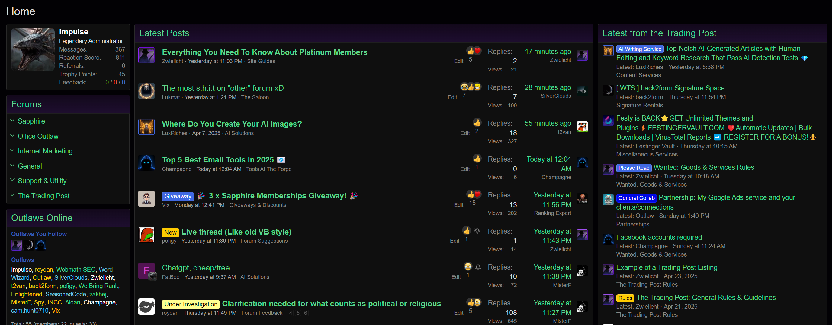
This is the concept homepage we have right now.

Some of you like having the subforums lists and some of you have found yourselves missing the giant feed.
I've been trying to think over a good middle-ground solution, and I wanted to share that with all of you before proceeding.
I understand many of you want some familiarity, and that feed is something that even I'm used to, even though I'm not very keen on it.
Now, I mentioned before that we don't want to just have a single giant list of threads on the homepage as this site is not meant to be a clone of the other forum. Additionally, that single feed format often led to a lot of frustration whenever someone decided to bump all of their sales threads at once. This concept page is meant to take that issue into account.
I see this as a chance to improve on things and I feel like the solution. The concept page makes the following changes:
Right now, we want feedback on how it is in the image above before we invest any more time into making it responsive or cleaning it up further.
If it's all right with everyone as well, I voted in the poll as well as I would actually like this as the homepage. However, please don't let that sway your vote and be honest if you don't like it.

Some of you like having the subforums lists and some of you have found yourselves missing the giant feed.
I've been trying to think over a good middle-ground solution, and I wanted to share that with all of you before proceeding.
I understand many of you want some familiarity, and that feed is something that even I'm used to, even though I'm not very keen on it.
Now, I mentioned before that we don't want to just have a single giant list of threads on the homepage as this site is not meant to be a clone of the other forum. Additionally, that single feed format often led to a lot of frustration whenever someone decided to bump all of their sales threads at once. This concept page is meant to take that issue into account.
I see this as a chance to improve on things and I feel like the solution. The concept page makes the following changes:
- Add two feeds at the top of the homepage: one for the discussion forums and the other for our Trading Post. These feeds could display 20 threads each just to start so we can see how it looks.
- Your profile box is at the top of the sidebar, as usual.
- A full list of subforums on the sidebar. Because we make use of prefixes here, we were able to cut down on the number of subforums, making it possible to feature the full list.
Right now, we want feedback on how it is in the image above before we invest any more time into making it responsive or cleaning it up further.
If it's all right with everyone as well, I voted in the poll as well as I would actually like this as the homepage. However, please don't let that sway your vote and be honest if you don't like it.
Last edited: