Resolved Updating The Homepage

This suggestion has been implemented or the issue has been resolved.

Do You Want This To Be The New Homepage?


  • Total voters
    17
  • Poll closed .
13 yes votes and 3 no votes.
 
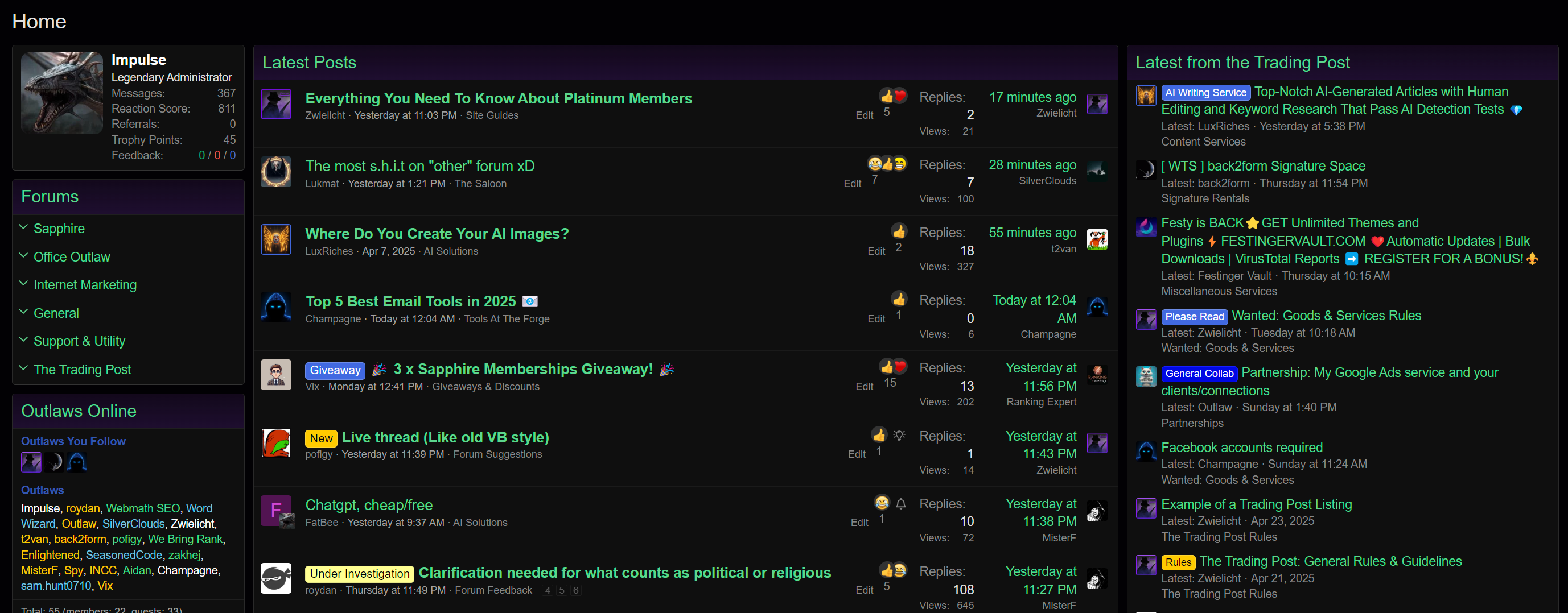
Since the votes are currently in favour of making this our new homepage, I have spent some time getting it more ready and fixing any issues there could be.

If anyone wants to the view the page to see what it looks like and test it out, you can find it here: https://officeoutlaw.com/pages/home/

e2ace547b16eb1e93d8519f0899df95e.png


You may notice that the main changes made to this is the Latest from the Trading Post section being a little smaller and simpler. This is because the equal split between the two was less visually appealing and we feel that there should be more of an emphasis on the posts from the forum. I'm hoping that this improves the appearance of the page but still is clear enough for members wanting to see Trading Post updates.

Please let me know if there are any bugs or issues that have been missed.
Didn't get a chance to vote cause I forgot but looks good to me. THX!
 
Since the votes are currently in favour of making this our new homepage, I have spent some time getting it more ready and fixing any issues there could be.

If anyone wants to the view the page to see what it looks like and test it out, you can find it here: https://officeoutlaw.com/pages/home/

e2ace547b16eb1e93d8519f0899df95e.png


You may notice that the main changes made to this is the Latest from the Trading Post section being a little smaller and simpler. This is because the equal split between the two was less visually appealing and we feel that there should be more of an emphasis on the posts from the forum. I'm hoping that this improves the appearance of the page but still is clear enough for members wanting to see Trading Post updates.

Please let me know if there are any bugs or issues that have been missed.
I think it's ready to go, but I was hoping for people to comment on the adjustment that was made.

Either way, it won the popular vote, so we'll set this to go live this week. I'll post an announcement thread about it later.
 
There's nothing wrong with tinkering to enhance the layout and structure.
Yeah, that's the thing. Once we set it as the homepage, we can always make adjustments to it later. Anyone who has suggestions can post them in the forum suggestions section as well and we can go based off the upvotes to make the changes.
 
Since the votes are currently in favour of making this our new homepage, I have spent some time getting it more ready and fixing any issues there could be.

If anyone wants to the view the page to see what it looks like and test it out, you can find it here: https://officeoutlaw.com/pages/home/

e2ace547b16eb1e93d8519f0899df95e.png


You may notice that the main changes made to this is the Latest from the Trading Post section being a little smaller and simpler. This is because the equal split between the two was less visually appealing and we feel that there should be more of an emphasis on the posts from the forum. I'm hoping that this improves the appearance of the page but still is clear enough for members wanting to see Trading Post updates.

Please let me know if there are any bugs or issues that have been missed.

The only suggestion I’d make here (for screens < 768px) would be to move the “X minutes ago” text to the end of the line/parent:

1746392832468.webp


In my example, I set .structItem-cell--meta and .structItem-cell--latest to width: 50% and removed the max-width. (Although, this can also be handled using Flexbox with justify-content: space-between.)

Thanks.
 
In my example, I set .structItem-cell--meta and .structItem-cell--latest to width: 50% and removed the max-width. (Although, this can also be handled using Flexbox with justify-content: space-between.)
@Impulse did this today.

We're going to hold off a bit on uploading the homepage as we need to fix a few issues with it. Also, we were doing it right now and realised that maybe fiddling around with stuff during peak hours wasn't a good idea.
 
  • Like
Reactions: Vix
@Impulse did this today.

We're going to hold off a bit on uploading the homepage as we need to fix a few issues with it. Also, we were doing it right now and realised that maybe fiddling around with stuff during peak hours wasn't a good idea.
Could use a designers' CSS the last time I seen it too dude, you do you boo - it's working out
 
We had to postpone this for now in order to prioritise some other changes to the forum. I just wanted to give everyone an update on this.
 
All right, @Impulse has officially added this in. Thank you to everyone who participated in this. :)
 
I preferred the forum list as the homepage. :(
I think a lot of votes are because we're familiar with another place. I voted for change, but I kind of got used to the forum list, only because it had recent posts on the sidebar. I wouldn't like a forum list homepage without recent posts somewhere easy to see. Overall, I think I slightly prefer the new style. Maybe that's partly because I intend to have a Trading Post thread in the future, but it's just nice to easily see new stuff.

I would prefer the forum list in the sidebar to be expanded by default, though, but maybe that's just me.

It's also nice not having to scroll down on mobile to see new posts.
 
Last edited:
Yeah I don't like the new home. I dunno If I voted, I think I may have been a fucking sheep and said yes.

What a tool. I hope I said no though, I really do. In the graphic it looked good, in action not so much.

I think if we keeping it, would be nice to maybe have a box above both columns that has watched forums or something? Not sure if thats possible or not, that way I can see anything I miss in topics I care about and the rest I'll worry about in latest or If I get tagged.

Just my 2p
It should be possible.

If you'd like, now that we have a custom homepage, you can start a thread on homepage improvements. The main thing everyone wanted was a feed, which they have now. However, that doesn't mean we can't improve the whole page even more.

Just as long as we don't do something crazy, like making the homepage version of this:
Everyone was wrong.

That car is awful also.
 
Back
Top